Here's the Symbian Anna web browser, finally improved
A big part of the Symbian^3 Anna update that Nokia unveiled on Money was the new web browser that reportedly brings improvements in both performance and usability. And the company seems pretty eager to show that it has done a good job with it, dedicating a whole post on its blog to revealing its strong points.
In unison with the rest of the refreshed interface, the new web browser has been equipped with a streamlined UI that has seen the removal of the double rows of icons at the bottom of the browsing window and has instead replaced them with a small overlay back arrow and an options icon that can call up various different tasks such as bookmarks, history or the exit button. That makes for some extra room up top to include a convenient address bar for easy URL typing and web searching.
Nokia N8 vs. Nokia X7
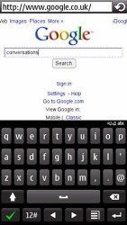
Speaking of which, we finally have split-screen typing view mode and a QWERTY keyboard in portrait mode. Those are little things that all owners of full-touch devices have taken for granted.
Portrait QWERTY in action
The web browse also has a new context pop-up menu that let you copy a link address or open it in a new tab.
Copy a link functionality
On the performance side of things, the new version 7.3 of the Symbian3 browser comes with a new 30% faster JavaScript engine and improved compatibility with HTML5. The new browser got 111 out of 400 in the standard HTML5 test, while the previous version only achieved 29. That’s some improvement.
From the looks of it, this is the largest step forward that the Symbian browser has taken since it went touch in 2007.


